BJ255 Insights
Exploring the latest trends and news in various fields.
Color Crush: How the Right Palette Can Transform Your Website
Discover how the perfect color palette can elevate your website, engage visitors, and boost conversions. Unlock your design potential today!
5 Essential Color Theory Principles for a Stunning Website
Color theory is a fundamental aspect of design that informs how we perceive and interact with colors in a digital space. To create a stunning website, it's essential to understand the five essential color theory principles that can elevate your design. First, consider the color wheel, which presents primary, secondary, and tertiary colors. Leveraging these colors effectively can help establish a cohesive palette. Second, learn about color harmony, which is the arrangement of colors in a way that is visually appealing. This includes techniques like complementary, analogous, and triadic color schemes, each serving unique purposes in enhancing user experience.
Third, don’t underestimate the importance of contrast. It not only improves readability but also guides users' attention to key elements on your page. Fourth, the psychology of color plays a crucial role; colors evoke emotions and shape perceptions. For instance, blue often conveys trust, while red can increase energy and urgency. Finally, the principle of brand consistency should not be overlooked. Utilizing a consistent color palette across your website enhances brand recognition and creates a unified visual identity. By applying these five essential color theory principles, you can craft a website that is not only visually appealing but also effective in achieving its goals.

How to Choose the Perfect Color Palette for Your Brand
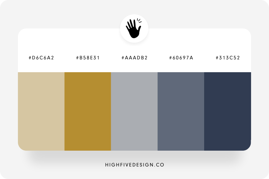
Choosing the perfect color palette for your brand is a crucial step in establishing a memorable identity. Colors evoke emotions and convey messages, so it's essential to select hues that resonate with your target audience. Start by identifying the core values of your brand and the emotions you wish to evoke. For instance, if your brand is associated with trust and professionalism, blue may be the ideal choice. Alternatively, if creativity and vibrancy are your focus, consider utilizing orange and pink. To streamline this process, you can create a mood board that compiles colors you admire and their meanings, enabling you to visualize how they might work harmoniously together.
Next, evaluate your chosen colors through practical application. Test how your color palette looks across various platforms, such as your website, social media, and marketing materials. A good strategy is to choose a primary color, a secondary color, and an accent color to create depth and variety. Remember to consider accessibility as well; ensure that your color combinations maintain readability and inclusivity. By carefully implementing your color palette, you not only strengthen your brand recognition but also foster a consistent image that resonates with your audience over time.
What Emotions Do Colors Evoke? Understanding Color Psychology for Your Website
Understanding color psychology is essential for creating a website that resonates with your audience. Different colors evoke distinct emotional responses; for example, blue is often associated with trust and calmness, making it an excellent choice for financial services or health-related sites. In contrast, red can evoke feelings of excitement or urgency, ideal for sales and promotions. Utilizing these emotional connections allows you to craft a more engaging user experience. Consider including a color palette that aligns with your brand’s message to enhance your site's effectiveness.
When designing your website, it’s crucial to recognize the significance of color in influencing visitors' perceptions and actions. Green promotes tranquility and is often used in wellness or environmental contexts, while yellow evokes optimism and creativity, suitable for innovative brands. By strategically leveraging these emotional associations, you can guide users toward desired actions—like signing up for a newsletter or making a purchase. Ultimately, understanding the emotions evoked by colors can help you tailor your website to better connect with your audience and drive engagement.