The Psychology of Color: How Your Website's Palette Affects Audience Perception
Color is a powerful tool in web design that can significantly impact audience perception. Research in the field of psychology indicates that different colors evoke distinct emotions and associations. For instance, blue often conveys trust and reliability, making it a popular choice for financial institutions, while red can stimulate excitement and urgency, frequently seen in sales promotions. By carefully selecting a website's color palette, designers can create an environment that aligns with their brand's message and resonates with their target audience.
Moreover, the psychology of color extends beyond mere aesthetics; it influences user behavior and decision-making processes. A well-thought-out color scheme can enhance user experience by guiding visitors through the site, helping them navigate more intuitively. For example, using contrasting colors for call-to-action buttons not only makes them stand out but also encourages clicks and conversions. In conclusion, understanding the effect of color on audience perception is crucial for anyone seeking to create an effective and engaging website.
Top Color Combinations to Avoid for a Stronger Brand Identity
Creating a strong brand identity involves careful consideration of color choices. While some combinations may catch the eye, others can detract from your brand's message. For instance, red and green, often associated with Christmas, can confuse consumers and dilute your brand's identity if used outside of a holiday context. Additionally, blue and orange can clash if not balanced properly, leading to visual tension that may turn potential customers away. Striking the right balance is crucial; therefore, it's essential to understand which color combinations to avoid.
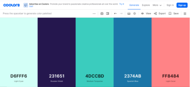
Another common pitfall is the use of too many bold colors at once. For example, a combination of yellow, pink, and turquoise can overwhelm viewers and create a chaotic look that lacks professionalism. On the flip side, using black and brown together can convey a lack of energy or dullness, failing to inspire engagement with your brand. To strengthen your brand identity, focus on harmonious color schemes that communicate your brand values while avoiding these ineffective combinations that can detract from your overall message.
Is Your Website Color Scheme Driving Customers Away?
The color scheme of your website plays a pivotal role in shaping user experience and influencing customer behavior. Studies have shown that colors evoke emotions and can significantly impact how visitors perceive your brand. For example, a website featuring bright, vibrant colors may attract a younger audience, whereas muted tones often appeal to a more professional demographic. If your color choices are misaligned with your target market, you could be unintentionally driving customers away. Consider conducting A/B testing to experiment with different palettes and analyze how changes in your color scheme affect user engagement and conversion rates.
Moreover, maintaining a cohesive color scheme is essential for establishing a strong brand identity. Inconsistencies can create a sense of confusion and dissatisfaction among visitors, leading them to abandon the site. Here are a few tips to ensure your website's color scheme works for you:
- Choose colors that reflect your brand’s personality.
- Limit your palette to three or four main colors for simplicity.
- Ensure that there’s sufficient contrast between text and background colors for readability.
By thoughtfully selecting and applying your color scheme, you can create a more inviting environment that encourages users to stay longer and engage with your content.
